
Why Visual Consistency Builds Creator Trust (And How Nano Banana Makes It Easy)
Why this is our moment


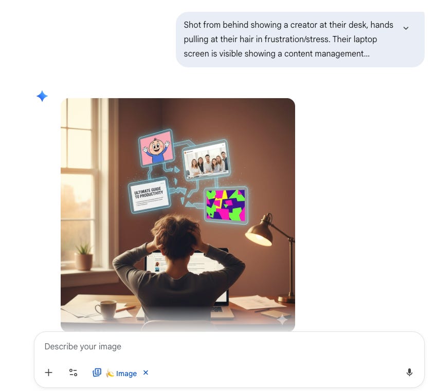
Your thumbnail is your first impression; it’s what stops someone from scrolling and leads them to look closer at the title and click.
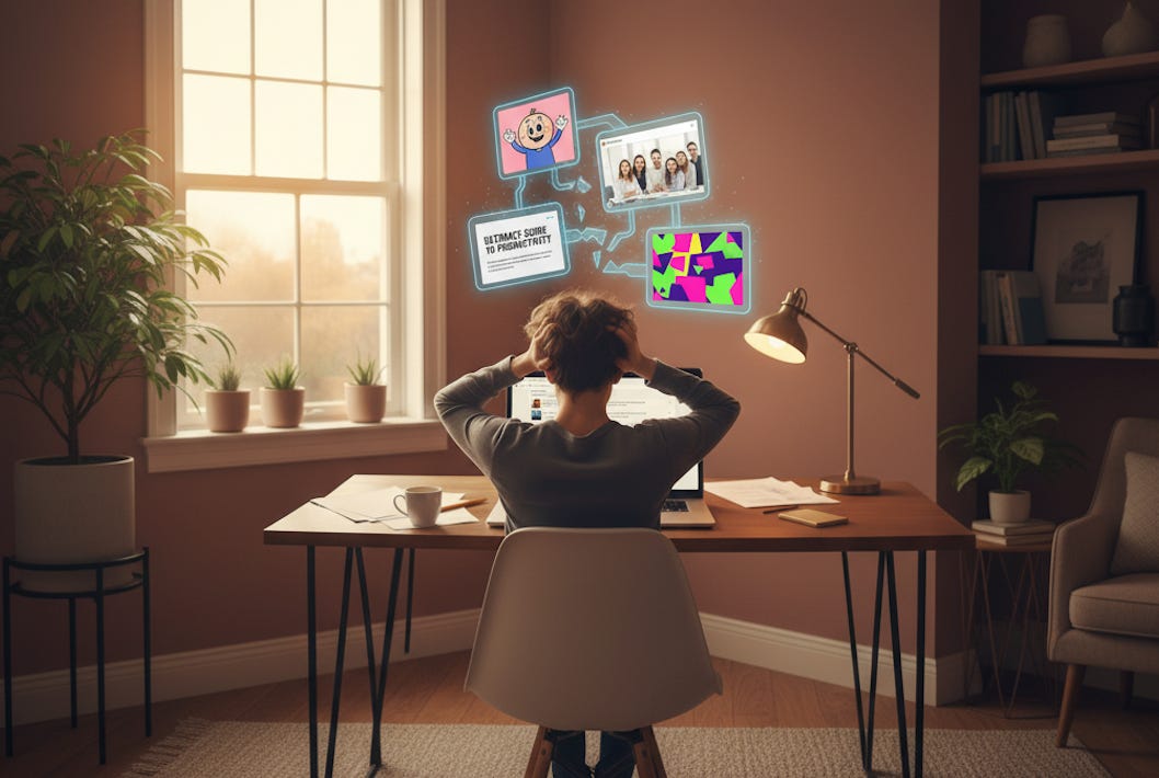
Last week, I saw a new creator’s post with a great title, but a cartoonish post thumbnail that clearly didn’t match the tone of the heading. I then clicked to see other posts of his, and it looked like three different people designed them. One post thumbnail was cartoonish, the next was a stock photo in harsh lighting, the third was text-heavy with clashing colors. Nothing connected.
Here’s the reality: research says it takes only 50 milliseconds for someone to judge your content based on visuals. That’s half a tenth of a second. Your expertise doesn’t get a chance to speak if your visuals don’t build trust first.
At the beginning of my creator journey, I struggled with this. I knew my content was solid, but my thumbnails didn’t reflect the care I put into my writing. Then I discovered a systematic approach that anyone can use.
You don’t need to be a designer, you just need to be strategic and consistent!
In this article, you’ll discover:
Why visual consistency builds creator trust faster than any other branding element
The psychology behind inconsistent thumbnails signaling inconsistent quality
My complete Nano Banana workflow for generating on-brand thumbnails in minutes
A free master prompt that creates your visual brand guide from your favorite thumbnails
How to integrate this into your process without adding hours of work
Why Your Visuals Matter More Than You Think
Most creators focus on perfecting their writing, recording better audio, or optimizing their headlines. All of that matters. But here’s what they miss: your visual identity does more work than any other element of your brand.
Consistent color palettes across your visual content can improve brand recognition by up to 80%. When someone scrolls through their feed and sees your thumbnail, they should recognize it’s you before they even read your name.
Your visuals send three trust signals:
They signal professional consistency. When your thumbnails look like they belong to the same family, readers assume your content quality is equally reliable. Random visuals signal random quality, even when your content is excellent.
They build familiarity through recognition. People trust what they recognize. A unified visual style helps readers develop a relationship with your work before they click. They know what to expect, and that expectation builds trust over time.
They show you care about details. Consistent branding tells readers you’re thoughtful about how your content appears. If you care about the details in your visuals, they assume you care about the details in your message.
Here’s what changed for me once I implemented this system: I got 30 to 45 minutes back per post. I publish twice a week. That’s 52 to 78 hours per year I redirected into content research and writing instead of agonizing over thumbnail designs.
But here’s the problem: most creators don’t have a visual brand guide.
They’re designing by feel, making it up as they go. One week, they like blue backgrounds. Next week it’s gradients, the week after that, minimalist text. There’s no foundation, no reference point, no system.
Without a brand guide, you’re not just inconsistent, you’re starting from scratch every single time. That’s why thumbnails take hours instead of minutes. That’s why your feed looks disconnected. And that’s why readers scroll past your content without recognizing it’s from you.
The Tool That Simplifies Everything
Google Nano Banana, the nickname for the image generator in Google Gemini, changed how I approach AI visual branding. The name comes from its development code, but what matters is what it does for creators like us.
Three reasons this works:
It understands complex prompts. Unlike earlier AI image generators, Nano Banana handles detailed brand guidelines. You can specify exact hex codes, those six-character color codes like #3C9EE7, right in your prompt, along with font styles, lighting preferences, and composition rules.
It generates high-quality images. Whether your brand guide calls for photorealistic visuals or illustrated content, Nano Banana delivers consistently high quality. Your thumbnails look professional without manual editing.
It’s fast and free. Generate a thumbnail in seconds. Not quite right? Zoom in or zoom out directly in the interface. No need to start from scratch. And you don’t need a subscription.
My Nano Banana Workflow
This is the exact process I use for every post. It takes minutes, not hours.
Step 1: Content Creation in Claude
I use Claude as my thinking partner for creating posts. This is part of what I call my Second Brain workflow, where Claude helps me research, write, and refine my content.
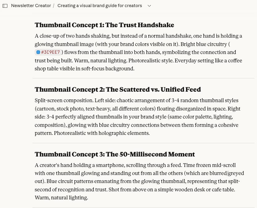
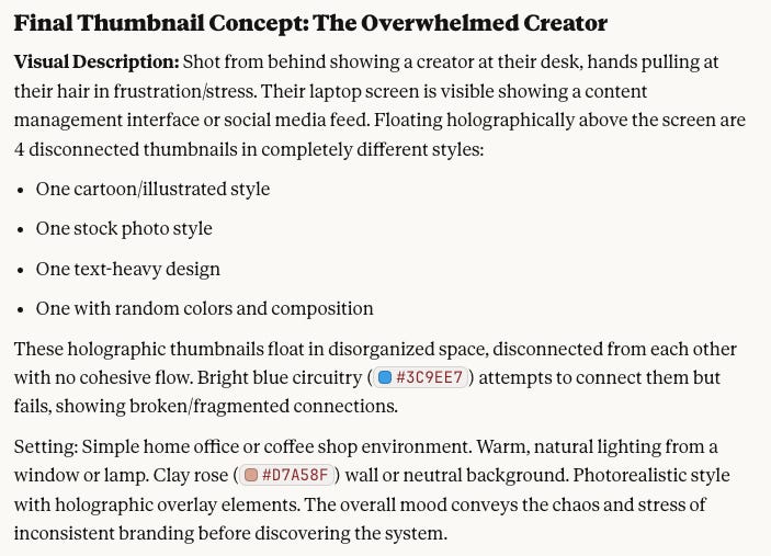
Once the post is finalized, Claude automatically provides five thumbnail concept ideas. These aren’t full designs, just a couple of lines describing visual concepts that represent the article.
Step 2: Choose or Tweak a Concept
I review the five concepts and either choose one as-is, combine elements from two concepts, or suggest my own idea if something specific comes to mind.
Once I’ve selected the concept, Claude generates a complete prompt for that visual.
Step 3: The Magic - Claude Embeds My Visual Brand Guide
This is where the system becomes powerful. Claude already has my complete visual brand guide stored in the project. My brand guide lives there, every color with exact hex codes, every font choice, the warm lighting I prefer, and how I arrange elements in frame. When Claude builds the prompt, all of this gets embedded automatically.
I don’t have to remember the guidelines. I don’t have to manually add them. The prompt is ready to go.

Step 4: Copy, Paste, and Generate in Nano Banana
I open Google Gemini, paste the prompt exactly as Claude provided it, and generate the image. No additional instructions. No tweaking.
Nano Banana understands the detailed brand guidelines and creates a thumbnail that matches my visual identity.
Step 5: Minor Adjustments (If Needed)
Most of the time, the first generation works. Occasionally, I’ll zoom in if the focal point needs more emphasis or zoom out if the composition feels too tight.
That’s it. No complex editing, just small refinements directly in the interface.
The result: A brand-consistent thumbnail that looks professional, matches my visual identity, and took less than five minutes to create.
How to Create Your Own Visual Brand Guide (Free Master Prompt)
You don’t need design experience to create a visual brand guide. You just need to identify what makes your thumbnails recognizable.
Here’s the master prompt I provide to my Premium Hub members. I’m sharing it as a resource for AI Soloist readers. Use this in ChatGPT, Claude, or Gemini, upload 2-3 of your favorite thumbnails, and it’ll generate a brand guide for you.
💡 Master Brand Guide Prompt:
I’m a creator who needs a visual brand guide for my content thumbnails. I’m uploading 2-3 examples of thumbnails I like (either my own or inspiration from others).

Based on these images, create a comprehensive visual brand guide that includes:

1. Color Palette: Identify the primary colors used and provide hex codes for each

2. Visual Style: Describe whether the style is photorealistic, illustrated, minimalist, bold, etc.

3. Lighting Preferences: Note the lighting mood (warm/cool, natural/dramatic, bright/subdued)

4. Composition Rules: Identify how elements are arranged (centered, rule of thirds, asymmetrical, etc.)

5. Typography Approach: Describe any text treatment (minimal text, bold headlines, specific font styles)

6. Consistent Elements: Identify any recurring visual elements (shapes, patterns, objects)

Format this as a reference guide I can provide to AI image generators like Google Nano Banana or ChatGPT when creating future thumbnails. Be specific with technical details (hex codes, descriptive language) so the guide can be copied and pasted directly into prompts.
How to use this:
Copy the prompt above. Paste it into ChatGPT, Claude, or Gemini. Upload 2-3 thumbnails you like. The AI generates your visual brand guide. Save that guide and use it whenever you create new thumbnails.
Getting Started
You don’t need to overhaul everything today. Start small.
Use the master prompt to generate your visual brand guide based on 2-3 thumbnails you like. Save that guide somewhere accessible. Create your next thumbnail using this workflow and see how it feels. Refine based on what works.
A recognizable visual style isn’t a one-time project. It’s a system that evolves with your brand. But once you have the foundation in place, everything else becomes easier.
If You Only Remember This
Look, I’m not a designer. Neither are you, probably. But here’s what I learned: visual consistency isn’t about being perfect. It’s about being recognizable. And in an AI-saturated world, that recognition is everything.
Three things to take with you:
It takes only 50 milliseconds for someone to judge your content based on visuals, which means your thumbnail does more work than you think
Google Nano Banana makes brand-consistent thumbnails accessible to non-designers by understanding complex prompts with embedded brand guidelines
The real advantage isn’t just a unified look; it’s the time you get back.
Here’s your next step: Take your three most recent thumbnails. Look at them side by side. If someone removed your name, would they know these came from the same creator? That answer tells you everything. If it’s no, use the master prompt above right now. It takes five minutes.
I hope this helps you, too. If you have any question, let me know! I’m here.
By the way, have you heard of Cozora yet? 🔥
Cozora is the new AI creator hub where 13 hand-picked experts share their real workflows live each week. It’s a community built for learning, collaborating, and finding your next co-founder to go big on AI projects together.
AND, as a paid subscriber to The AI Soloist, you’ll get 50% off. 🤯
 | A guest post by
|
Thanks Joel, and another excellent guide that has helped me to improve my processes! Slightly leftfield question: do you keep the watermark for Gemini images? I used to remove it for aesthetic reasons, but now leave it in so my readers know where I have made it.
Brilliant story — I have a very similar process using Claude as proofreader and just implemented a brand element through Canva. I am still figuring it out but find it so much easier to have the visual process somewhat streamlined before fumbling through thousands of stock images I may or may not use. Thank you for sharing!